
AI animation styles
Retro comic book animation: your script as a 1950s pulp serial
Retro Comics draws every scene as if it came off a 1950s press: bold ink, a handful of printing inks, halftone dots for the shading and paper gone yellow at the edges. Paste a story, from a jungle expedition to the history of the family car, and it comes back as a pulp serial with the same square-jawed hero in every panel.
100 free credits · no card
What Retro Comics looks like
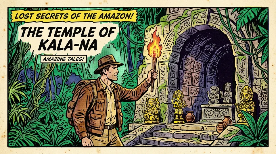
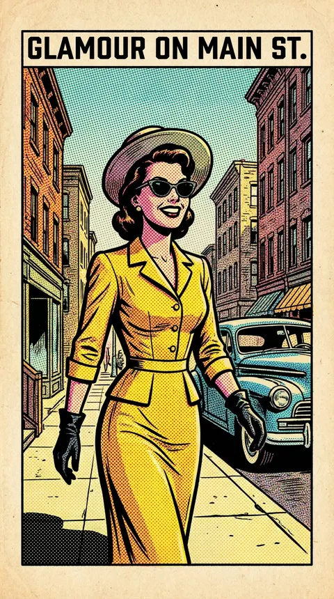
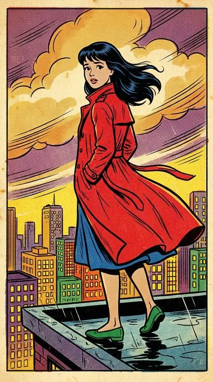
This is a comic from the age of letterpress. Outlines are bold and of an even, medium weight, with the slight wobble of ink pressed into cheap paper. Colour is limited to what a four-ink press could print: red, royal blue and yellow first, then emerald, warm orange and deep purple, all as flat opaque fills. Midtones and shadows are not smooth. They are Ben-Day dots, regular halftone circles set at an angle, and they give the whole frame its printed grain.
The paper has aged to a yellowish cream, with foxing spots and a colour plate that sometimes sits a hair off the line. Light is flat and even, and shadows come as denser dots rather than dark shapes. People follow golden-age ideals, seven heads tall: square-jawed men, glamorous women, open, wholesome faces with simple eyes. Backgrounds are flat planes of colour with little detail, livened up by speed lines and starbursts. The model often adds cover-style captions as well, like the headline over the jungle temple.
What to make with it
- Pulp adventure serials
- Expeditions, lost temples, rocket ships, and every episode ending on a cliffhanger. The style already looks like a weekly serial; a narrator with a newsreel voice completes it.
- Mid-century history
- The space race, the first television on the street, the story of the diner, the family car or the transistor radio. Period clothes and cars sit naturally in the palette, and the viewer reads the decade before a word is said.
- Retro-futurism
- “How 1955 imagined the year 2000”: flying cars, robot maids, cities under glass domes. The joke is the gap between the wholesome drawing and the strange ideas.
- Family and company histories
- A grandfather's workshop, a factory that opened in 1958, the family legend about crossing the ocean, told as a comic from the year it all began.
How to make a retro comic video in Insaga
Four steps, with the choices this style rewards.
Pick the mode for the story
An adventure with a recurring hero wants the Characters mode, which draws the hero's sheet first. A history of objects or inventions can go through Illustration, the fastest mode, where each scene is drawn straight from the text without a fixed cast; the Nano Banana Pro model works in this mode.
Choose Retro Comics
In the “Choose a style for your story” window, pick Retro Comics. Every frame gets the dots, the flat light and the yellowed paper.
Use Panoramic for the world
The Panoramic camera favours wide shots with close-up anchors: jungles, launch pads, small-town streets. Keep Cinematic for character stories; it runs only in the Characters mode.
Finish with a cover
Voice the narrator, add your music, build the thumbnail from one of 79 templates with a panel as the cover art, and export an MP4 in 1080p or 4K.
Retro Comics and its neighbours
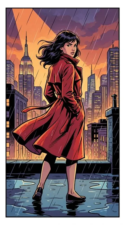
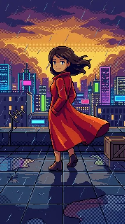
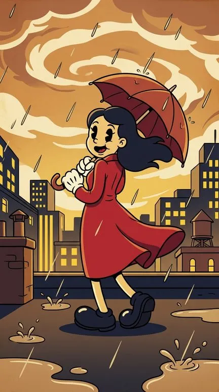
Classic Comics is what the same tradition became later: directional light with hard cast shadows, richer backgrounds, clean digital ink, no dots and no aged paper. Pixel Art is the nostalgia of another decade, built from square pixels and a 16-bit palette instead of ink and halftone. Modern Rubber Hose is older still: the 1930s cartoon with noodle limbs, pie-cut eyes and white gloves. It is animation's past, where Retro Comics is print's. Below, the same heroine in all four.
Writing for the retro comic look
Write the era into the script. Name the car, the hat, the radio, the diner; the style draws a period convincingly once it knows which one. Give each scene one simple idea: the backgrounds are flat, so a panel is carried by a figure and a gesture rather than a detailed setting. A narrator's exclamations (“Little did they know…”) suit the look, and so does ending each episode on a question.
Modern life looks odd here. A smartphone or an open-plan office in halftone reads as parody, which is fine if you mean it and jarring if you don't. The style is also a poor fit for grim realism: its faces are too wholesome for a war drama or a murder scene, and it has no deep, moody light. Dirty Comics or Noir will serve those stories better.
Questions about this style
Will every frame have the dots and the yellowed paper?
Yes. They are the style itself, not a filter laid on top. If you want the 1950s mood without the print texture, build a custom style from your own references, available from the Director plan up.
Can I get a real cover headline in the frame?
The model often adds captions, like the ones on the temple and Main Street frames, but spelling is not guaranteed. Put titles you need word for word in the subtitles or on the thumbnail.
Can I set a modern story in this style?
Yes, and it will read as a pastiche: a startup founder drawn as a 1950s hero. For a modern story told straight, Classic Comics fits better.
Is it suitable for children?
The faces are wholesome and the palette is cheerful, so a family adventure sits well in it. What the story shows is up to your script.
Will characters with such simple faces stay recognisable?
The reference sheets keep them, but a simple face leans on its costume. Give every character one thing you can spot from across the room: a red scarf, a flying helmet, a yellow suit.
Which decade does it draw?
The 1950s and early 1960s by default: the print, the clothes, the faces. Name another decade in the story and the props and costumes follow it, while the dots and the yellowed paper stay.
Keep going
Print your first episode
Paste a story, pick Retro Comics and see the first panels before you pay: 100 free credits, no card. Voiceover, animation and export are on paid plans.